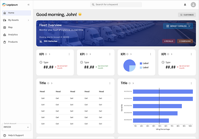
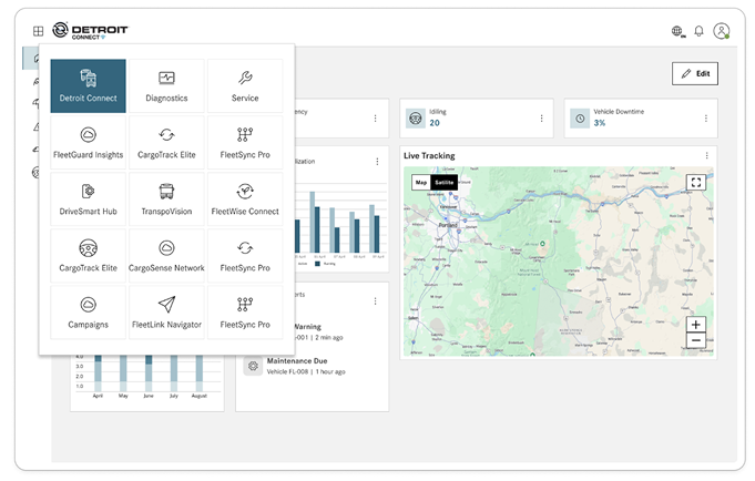
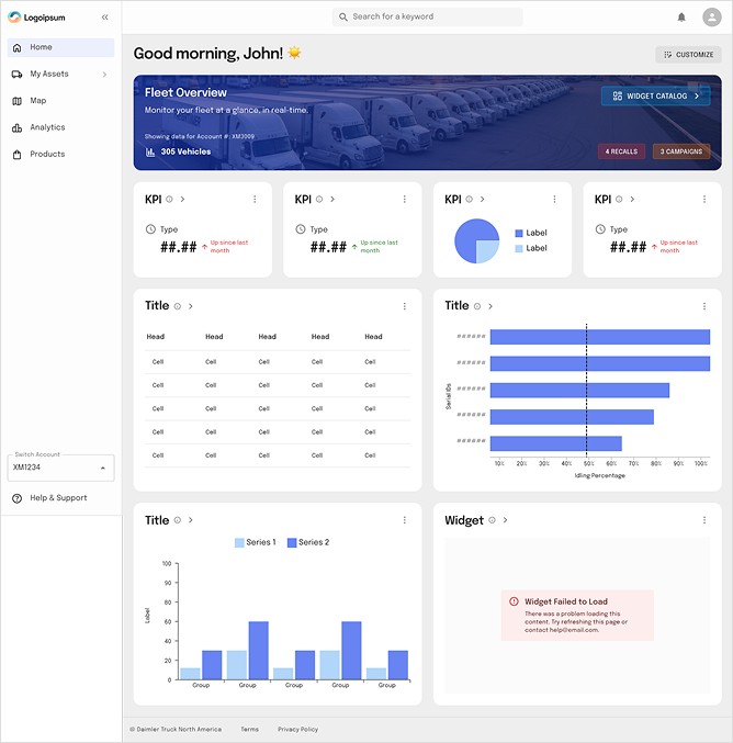
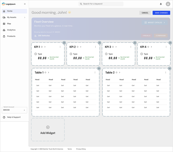
Fleet managers frequently switched between systems to gather operational insights, leading to fragmented workflows, delayed decisions, and reduced visibility across the fleet ecosystem. To address this challenge, we designed a Unified Fleet Intelligence Platform that consolidates all fleet products into a single customisable dashboard experience.
My Role (Senior UX Designer)
Product strategy alignment
UX research and stakeholder workshops
Information architecture redesign
Widget framework definition
Dashboard customisation experience
Design system integration
Cross-functional collaboration with Product and Engineering
Usability validation and iteration
My Contribution
Workshop facilitation
Widget framework definition
Led UX research
Initial dashboard concepts
Problem Statement
Large fleet organizations relied on multiple disconnected products to manage their operations: Fleet Tracking, Vehicle Health, Fuel Management, Driver Performance, safety & Compliance, Diagnostics, Service & Maintenance Fleet managers oversee multiple operational domains simultaneously. However, critical information was distributed across separate products.
Challenges
Users needed to log into multiple modules to monitor operations.
Different dashboards presented information inconsistently.
Decision-making required manually correlating data from various products.
Important KPIs were often overlooked.
Every fleet organisation had different priorities and reporting requirements.
Existing dashboards lacked personalisation.
Business Goal
Create a centralized fleet command center that:
Provides a unified view across all subscribed products.
Reduces navigation between multiple applications.
Enables faster operational decisions.
Increases engagement with platform features.
Encourages adoption of additional subscribed services.
Creates a scalable foundation for future product integrations.
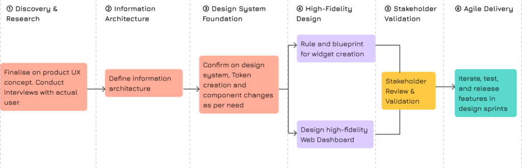
UX Strategy & Design Process
UX Research
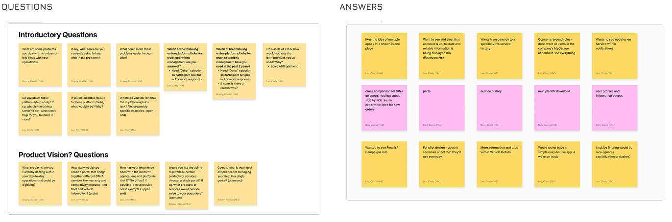
To understand how fleet managers consume information and interact with operational data, we conducted two independent brainstorming sessions with product managers, UX designers, business analysts, and subject matter experts.
Objective
What makes a widget useful? What information should appear on a dashboard and widgets? How users prioritise data across fleet operations? How to create a scalable dashboard framework that can support multiple products and future modules.
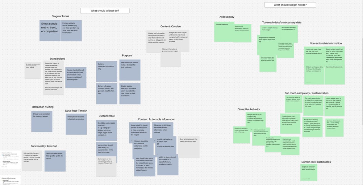
Brainstorming sessions on widgets
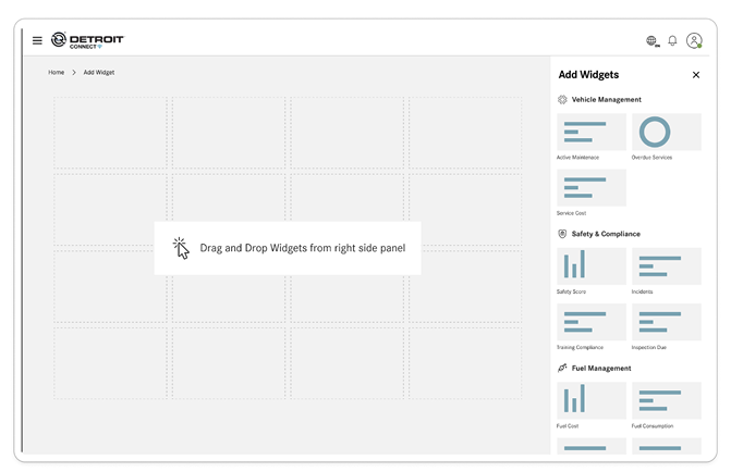
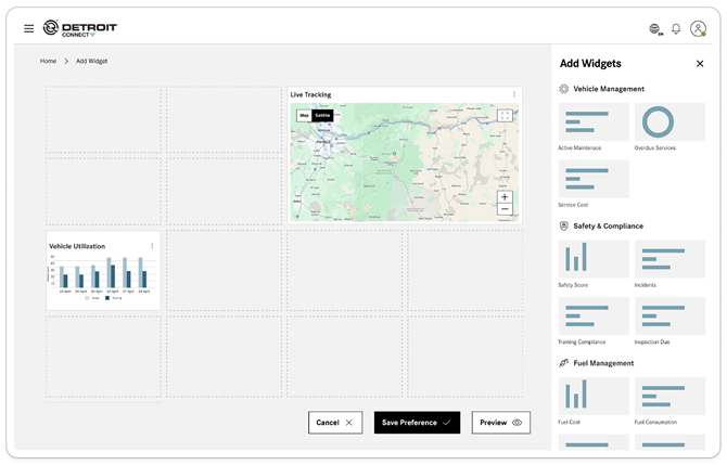
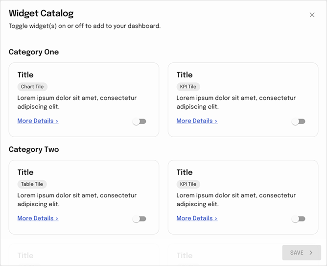
Before designing the dashboard, we first defined what a widget should be and how it should behave within a unified fleet ecosystem.
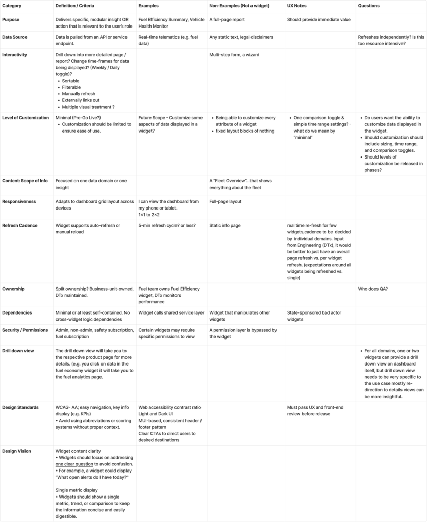
Widget Definition Framework
Establishing the criteria, standards, and governance model for dashboard widgets.
Outcome
What We Took Forward
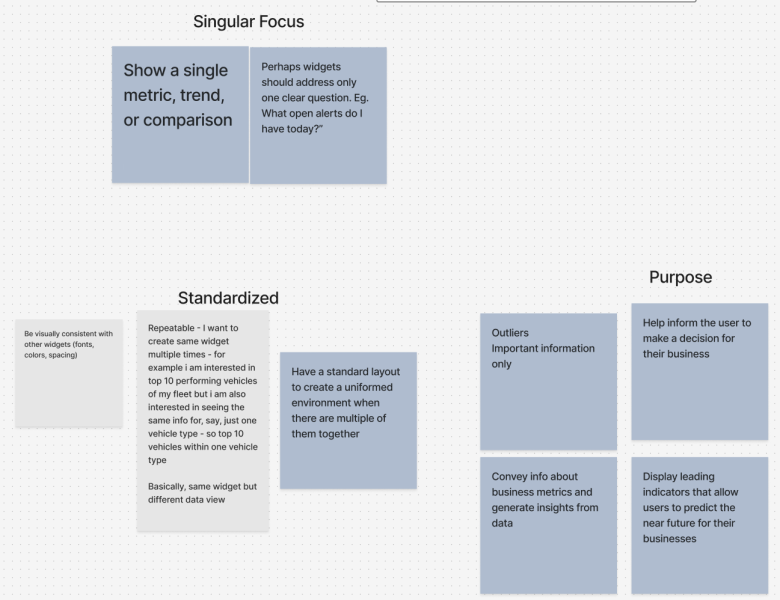
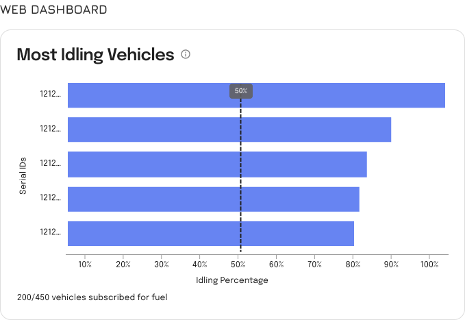
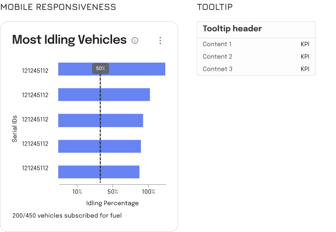
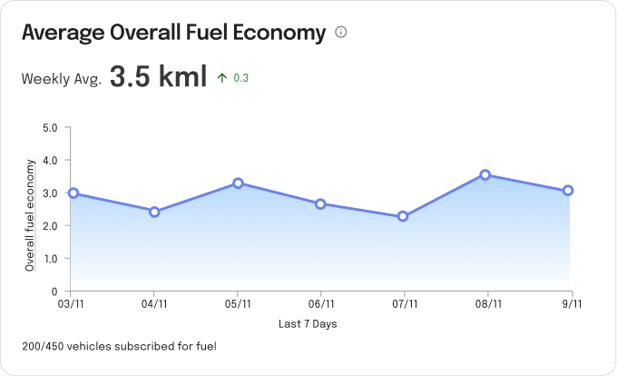
Single metric, trend, or comparison per widget.
Each widget should answer one clear business question.
Focus on actionable information rather than raw data.
Present KPIs that can be understood at a glance.
Support drill-down to relevant modules for deeper analysis.
Maintain consistent layouts, spacing, and interaction patterns.
Ensure widgets are reusable across multiple fleet products.
Use clear labels and terminology to improve accessibility.
Display leading indicators that help predict future risks.
Keep widgets lightweight and focused on decision-making.
Standardize widget structures to create a unified dashboard experience.
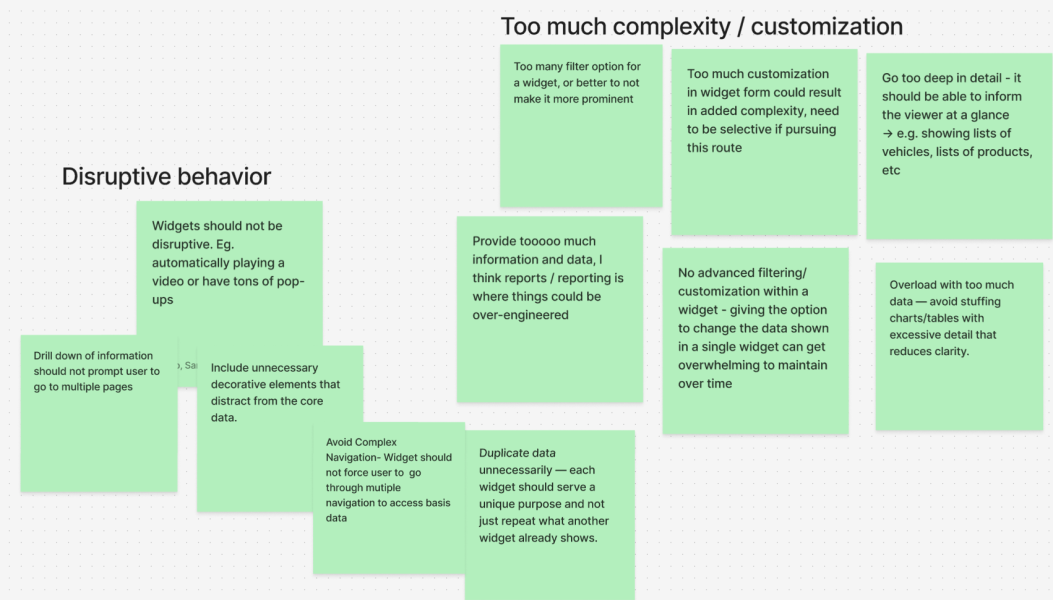
What We Avoided
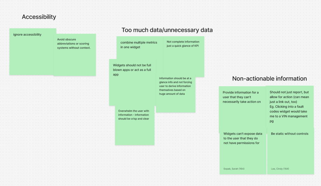
Information-heavy widgets with excessive charts and tables.
Turning widgets into mini applications or full reporting screens.
Advanced filtering and excessive customization within widgets.
Auto-playing content, pop-ups, or disruptive behavior.
Multiple navigation layers to access basic information.
Duplicate KPIs across multiple widgets.
Showing detailed lists of vehicles, products, or records directly in widgets.
Overloading users with unnecessary metrics and data points.
Inconsistent widget layouts and interaction patterns.
Exposing information users do not have permission to access.
Unclear abbreviations, scoring systems, or technical jargon without context.
Core principle
Singular Focus
Actionable Insights
Standardization
Clarity Over Complexity
Scalability
Dashboard Discovery
Once widget principles were defined, the team focused on understanding what makes an effective fleet dashboard. The goal was to identify how users consume information and what information hierarchy supports faster operational decisions.
Outcome
What We Took Forward
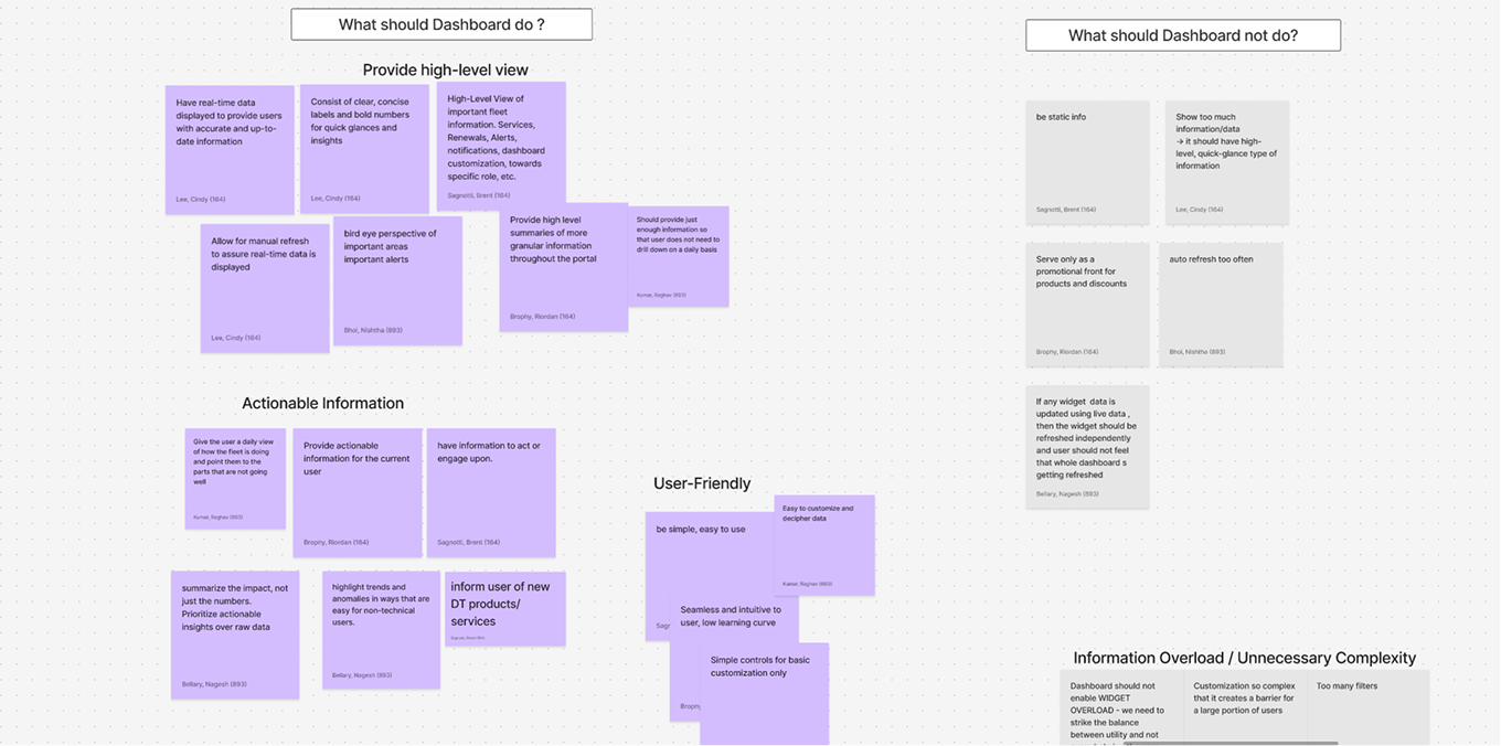
Provide a high-level overview of fleet operations.
Surface actionable information instead of raw data.
Prioritize critical KPIs and business metrics.
Enable users to identify issues at a glance.
Present information in a clear visual hierarchy.
Support different user roles through dashboard customization.
Focus on predictive and operational insights.
Keep dashboards simple, scannable, and user-friendly.
Allow users to personalize their dashboard based on priorities.
Group related information together for better context.
What We Avoided
Information overload and unnecessary complexity.
Displaying excessive data on a single screen.
Showing detailed reports directly on the dashboard.
Non-actionable metrics that do not support decisions.
Cluttered layouts with competing priorities.
Fixed dashboards that serve every user the same way.
Deep navigation paths for frequently used information.
Duplicate information across multiple widgets.
Overly technical data without business context.
Dashboard experiences that require users to interpret large volumes of data.
Core principle
Visibility at a Glance
Action-Oriented
Personalized Experience
Clarity Over Quantity
Operational Efficiency
User interviews Quantitative
Onshore team has performed the quantitative analysis with the current users
Product concept shown to user
Customer Feedback on current feelings
Good concept, right direction
Keep it simple, don’t make it complicated
Simple, intuitive filtering function would be nice (even if certain characters are not exact, like capitalization or dashes)
Can be a logic added to the search function
Concern towards extra transactional processes per vehicle – more CX features/experiences may be more attractive
“Market is not good. We don’t want to spend more money on each vehicles. Like $9 extra per vehicle.”
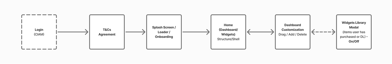
Information Architecture
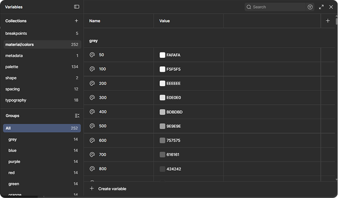
Design System Foundation
Components
Leveraged the MUI component library and customized components to align with project requirements.
Established a scalable design token and variable system to easily adapt design guidelines across multiple brands.
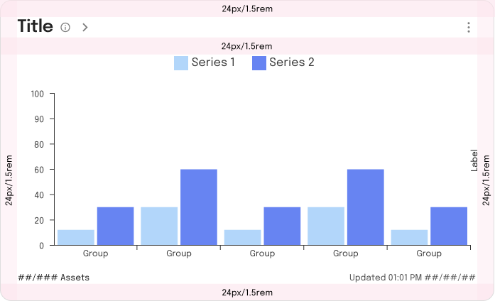
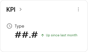
Widget guidelines
Border radius is defined by borderRadiusLarge variable
All paddings are defined by spacing variable 3 (24px)
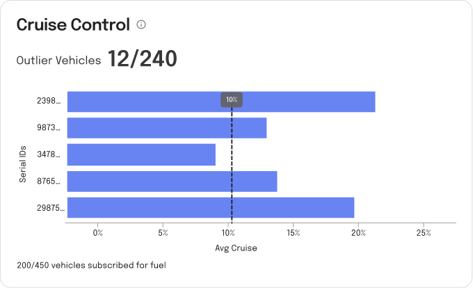
Maximum 5 data points
Widgets are a snapshot and should allow user to drill in for more information on a full page.
Small widget height=200px
Medium widget height=424px
Dashboard Direction
The project continues to evolve with the onshore product and design teams.
 Ongoing
  50,000+ Vehicle
  12 Modules
  Region – India